
Cross Keys Equine Therapy
A certified practitioner of Equine Therapy and faith-based non-profit in the Shenandoah Valley, Cross Keys offers a wide variety of therapy services with their horses.
Role
Visual Designer
Tools
Figma
Canva
Miro
Time Frame:
4 weeks
Team
Teagan Sloan
Ash Conley
Amy Dorner
Brad Weddington
Project Type
Website Redesign
Background
Cross Keys Equine Therapy felt their current website looked aesthetically outdated, and wanted a fresh, modern design which showcased the credibility of their services and team.
The website itself had a very standard format, but with heavy blocks of unsegmented text, unclear links, and a poorly designed booking process.
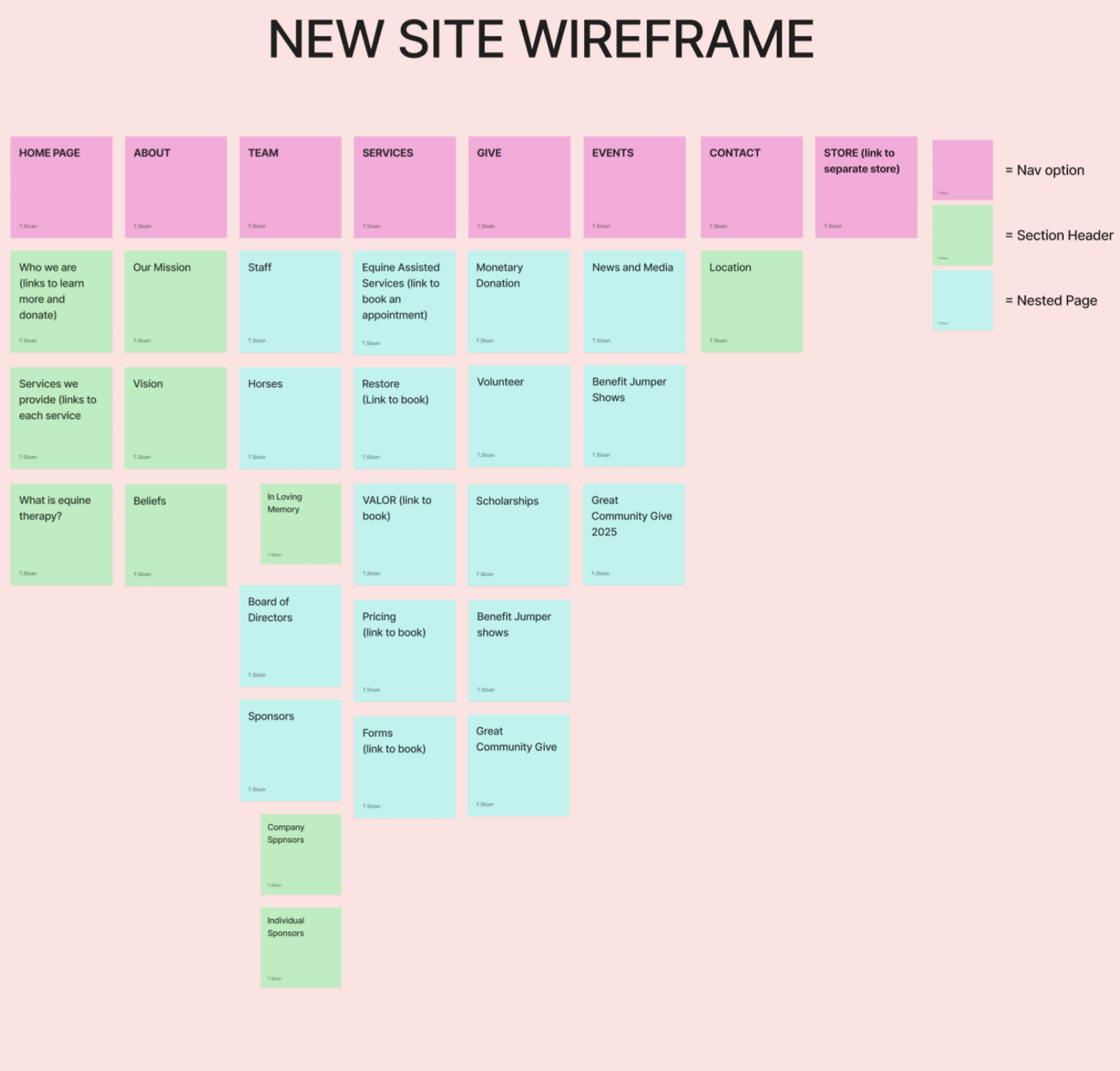
We chose to follow the principle of “less is more”, and focused on dividing the text-heavy pages, which covered many different topics, into more pages so each one had less content.
Context
This project was given to us very late in the year, and our busy schedules did not always line up. As such, we found we had to divide the workload in such a way that we could all contribute on different schedules.
We also made a point to clear a day halfway through the process so we could all visit the farm to get a better idea of the farm’s atmosphere and client’s needs. This helped us to sort out client needs vs. nice-to-haves.
Design Questions
-How might we make booking an appointment easier for the user?
-How might we reorganize their content so it does not overwhelm the user?
-How might we communicate client credibility to users?
Before Redesign:
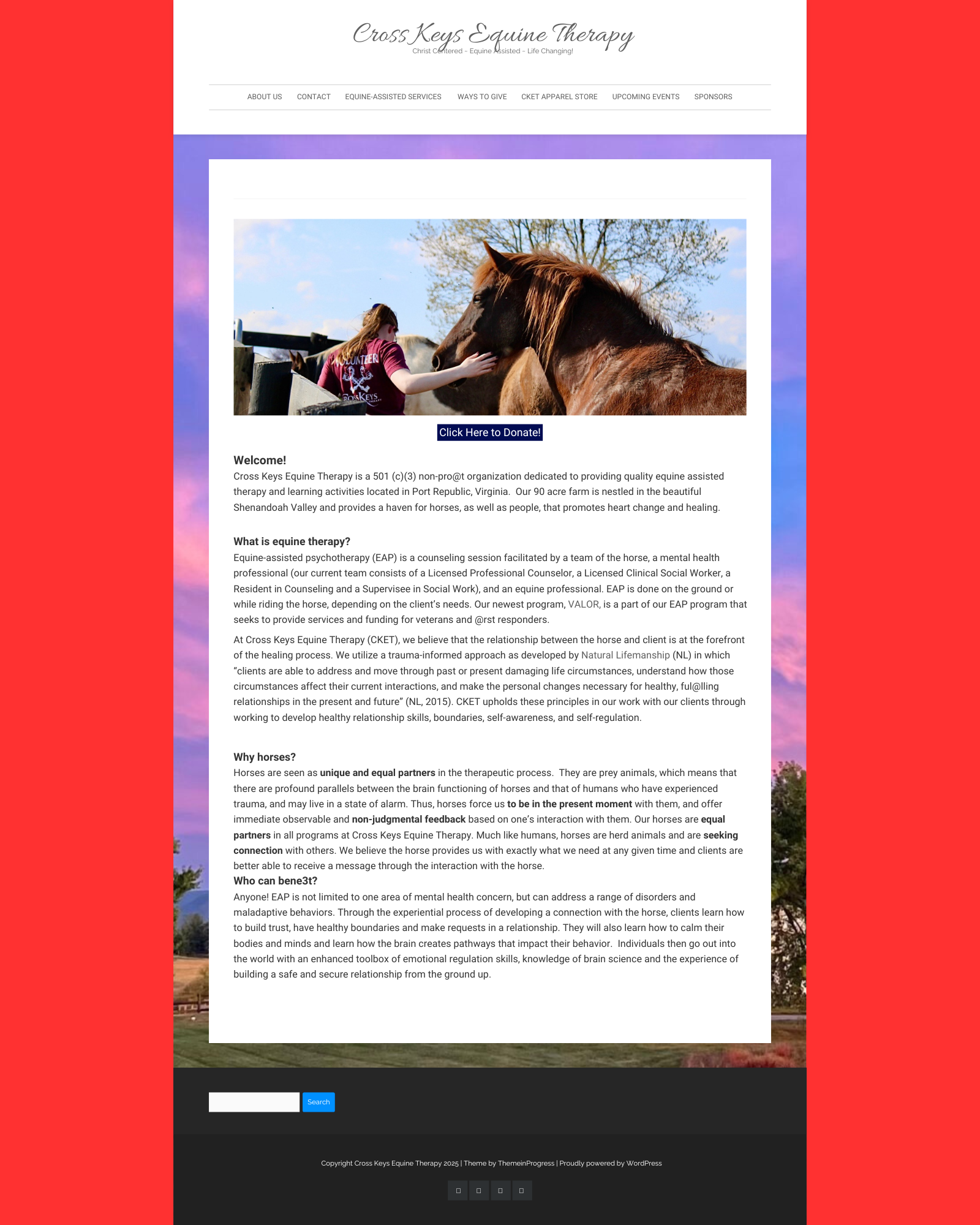
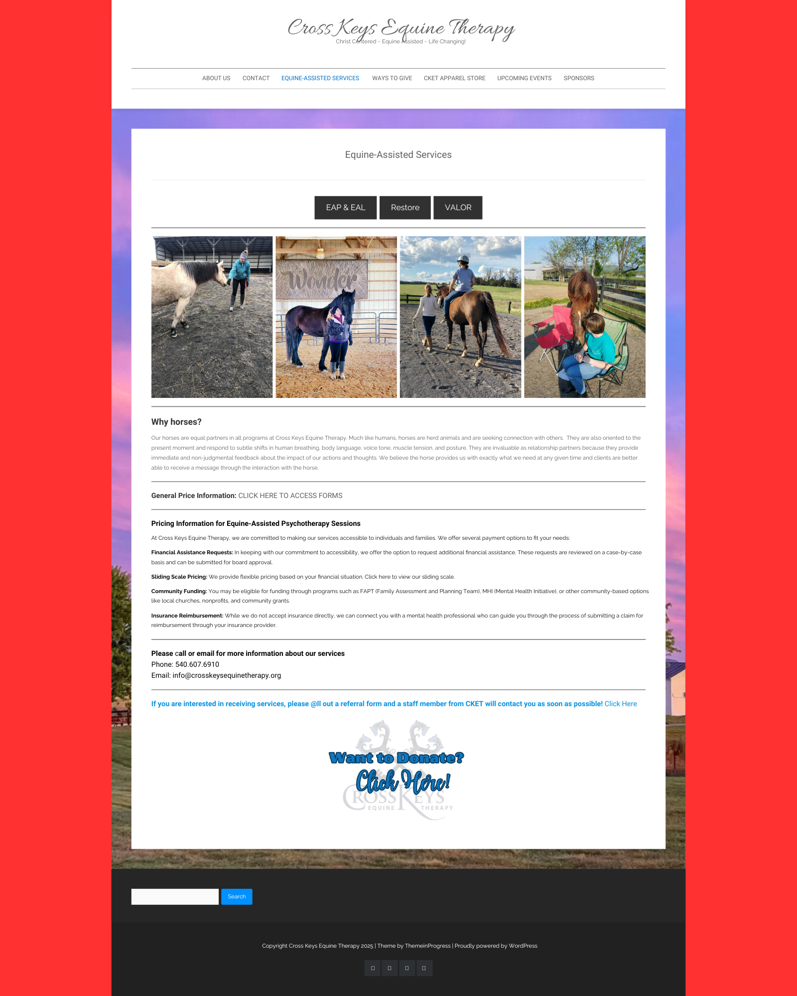
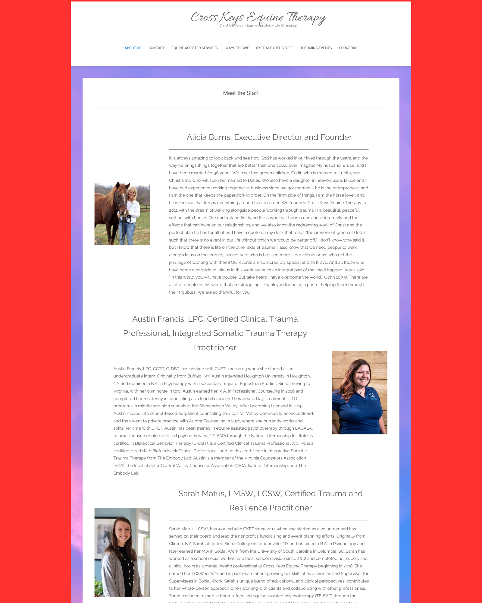
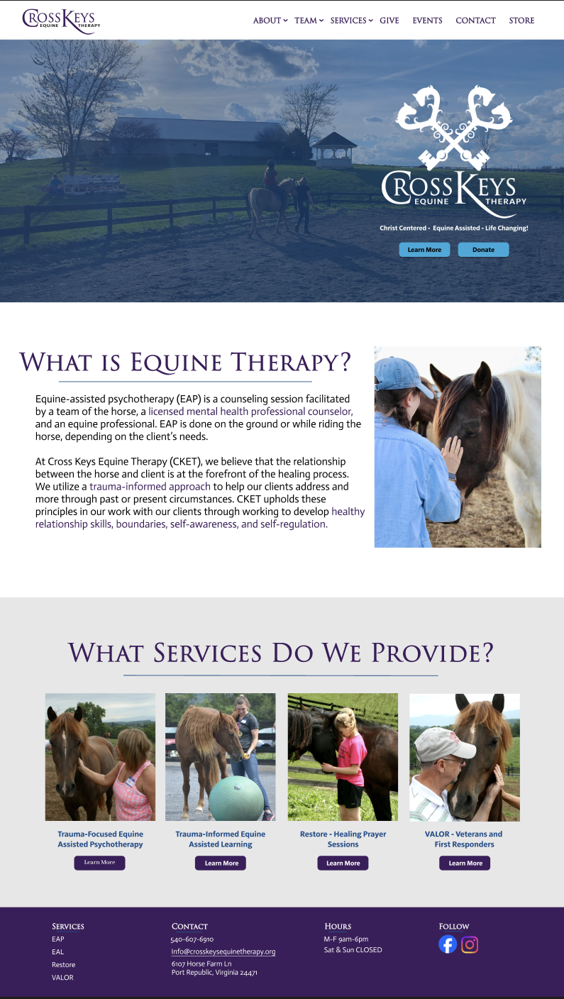
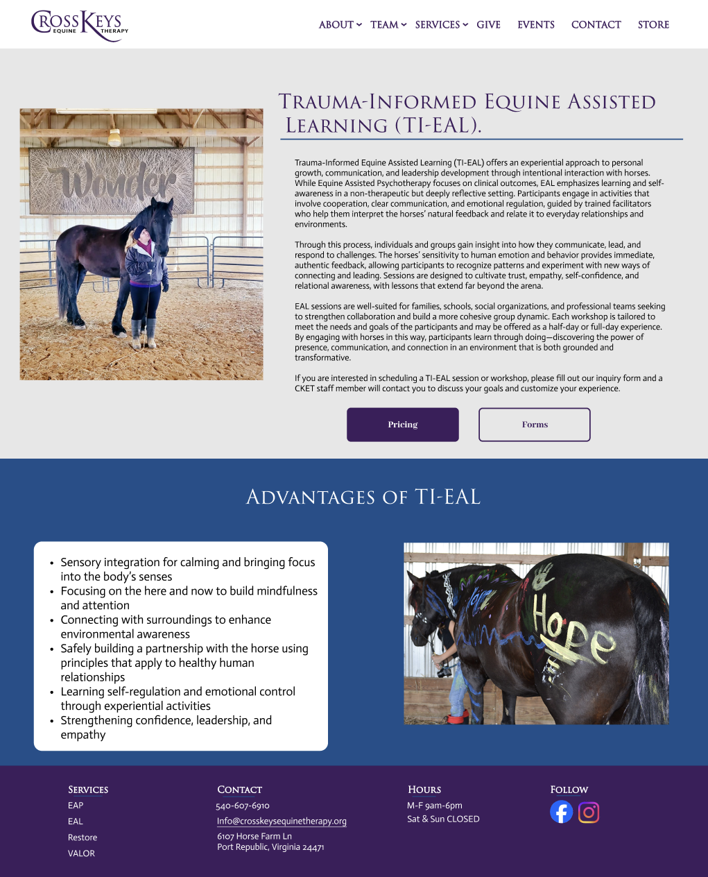
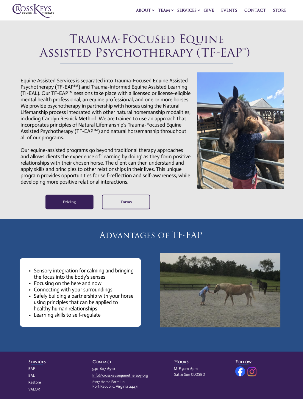
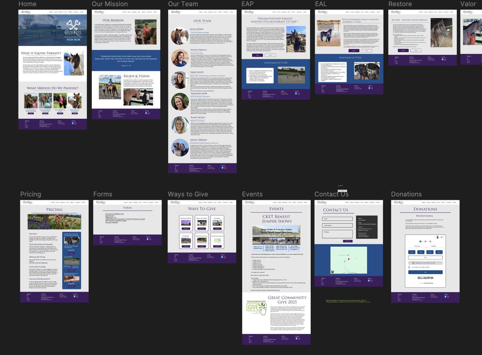
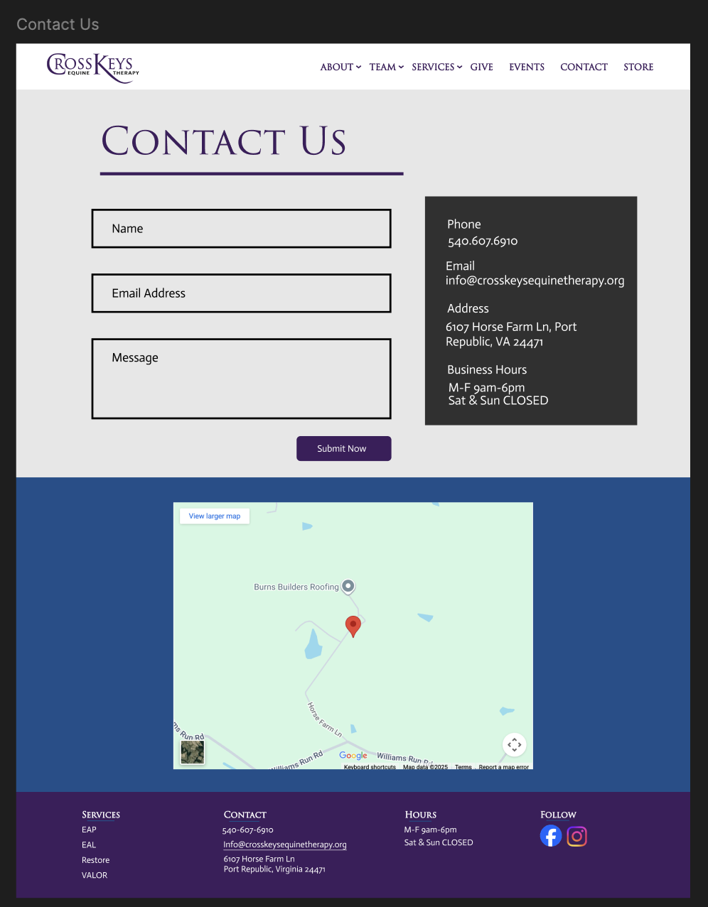
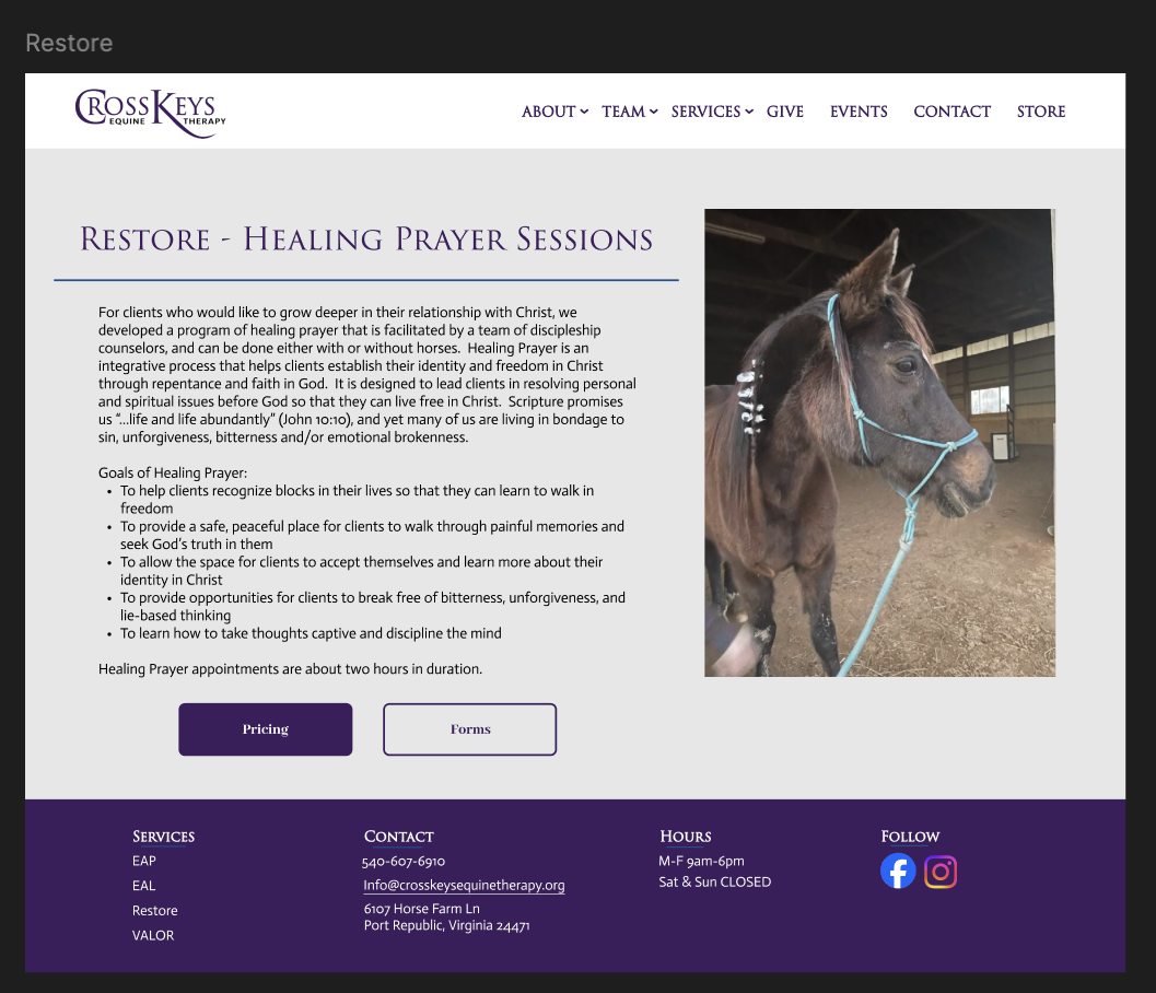
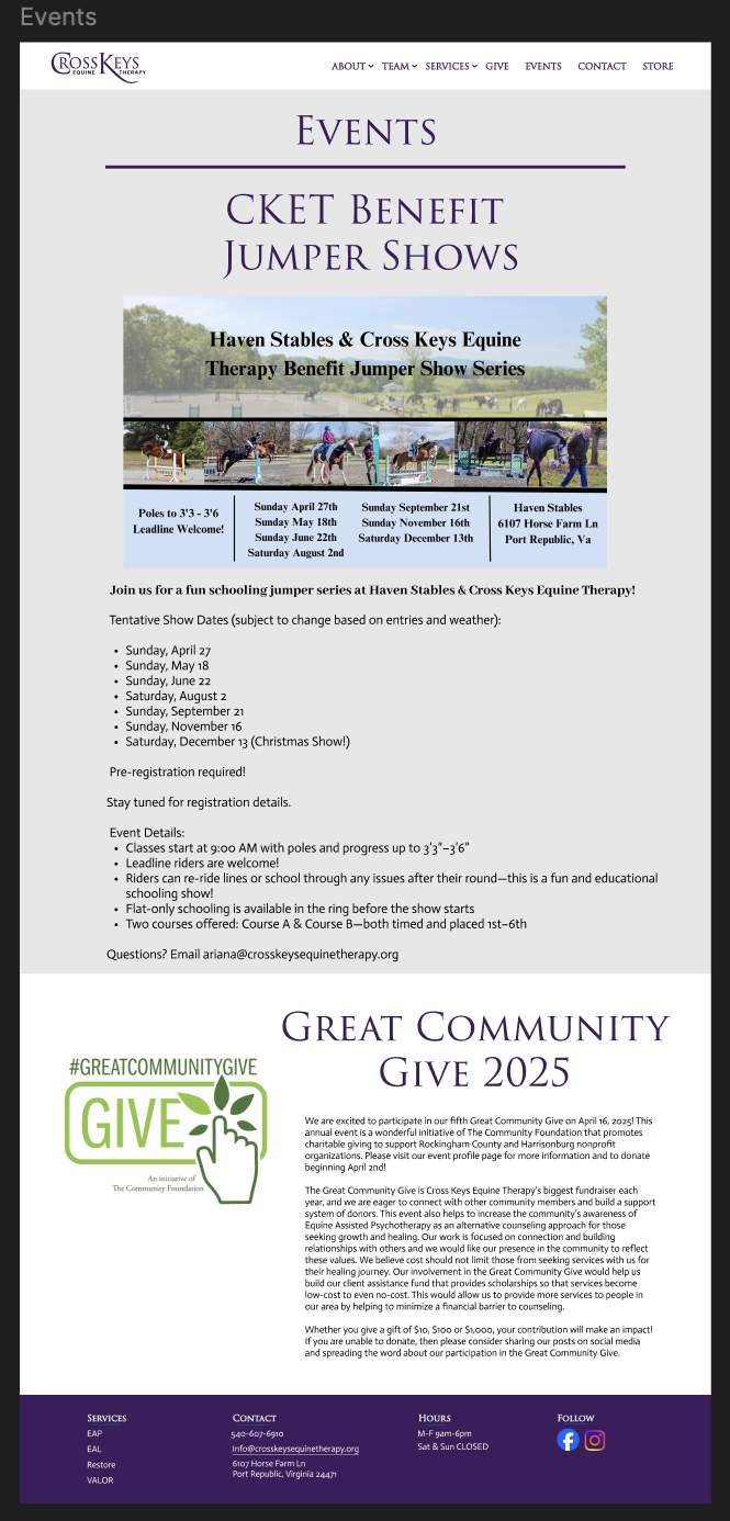
After Redesign:
THE PROCESS
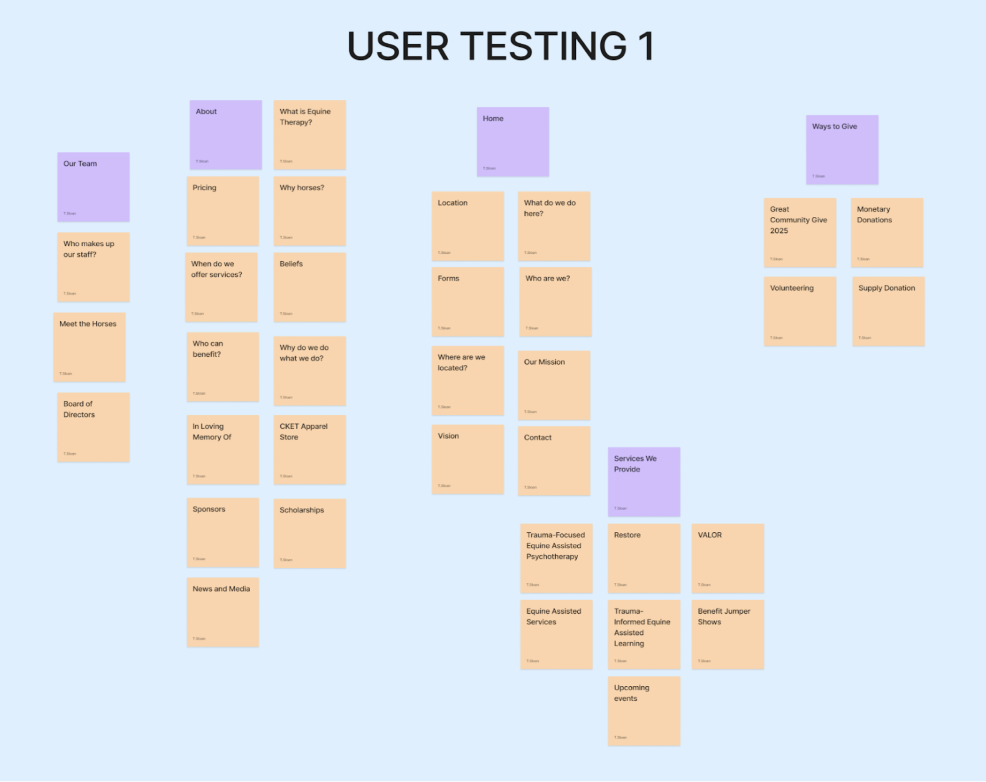
Usability Testing Card Sorting Technique:
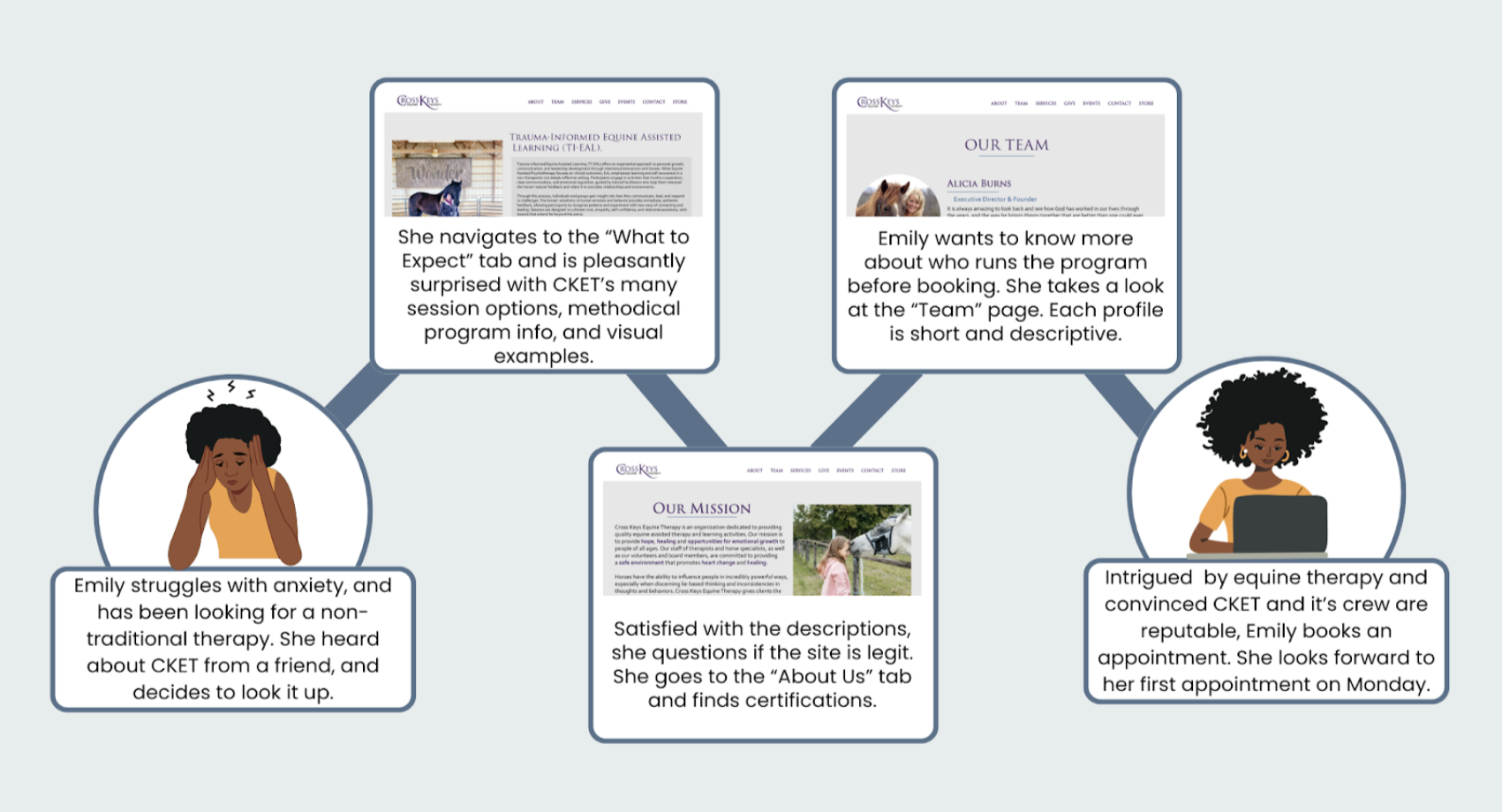
User Stories
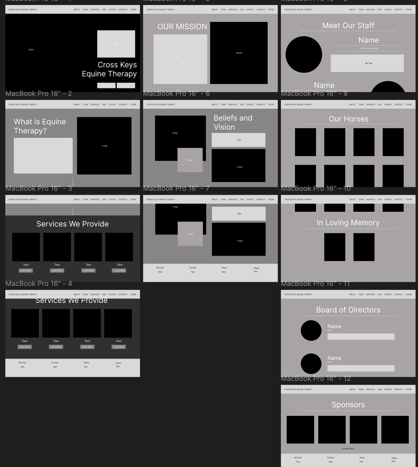
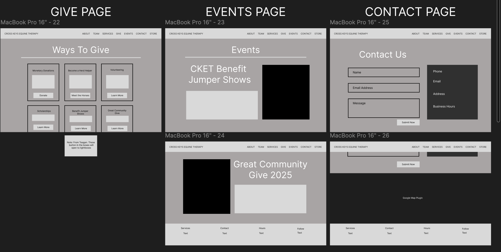
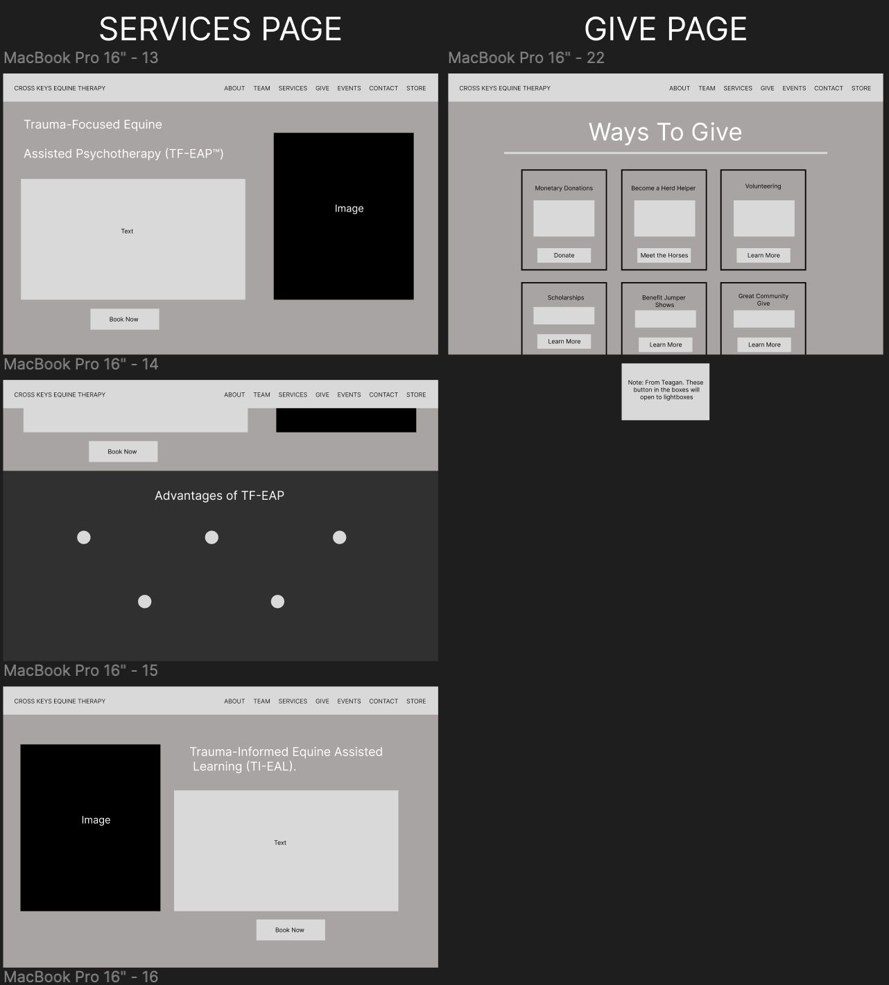
Wireframes
While our team started on the website audit, Teagan conducted usability testing using a card-sorting technique where subjects put information under the nav item which made the most sense. Soon after, we made personas and I started on the User Stories.
Amy and I were out of commission soon after, so the rest of the team pieced together a wireframe while we were gone.
When we got back, Amy and I started on the high fidelity prototypes and branding while Teagan and Ash organized our deliverables into a single document.
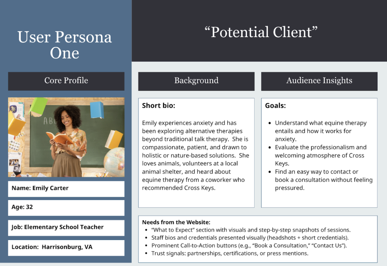
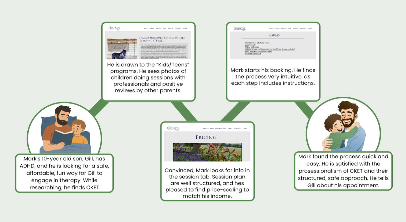
Primary Persona: the Potential Client
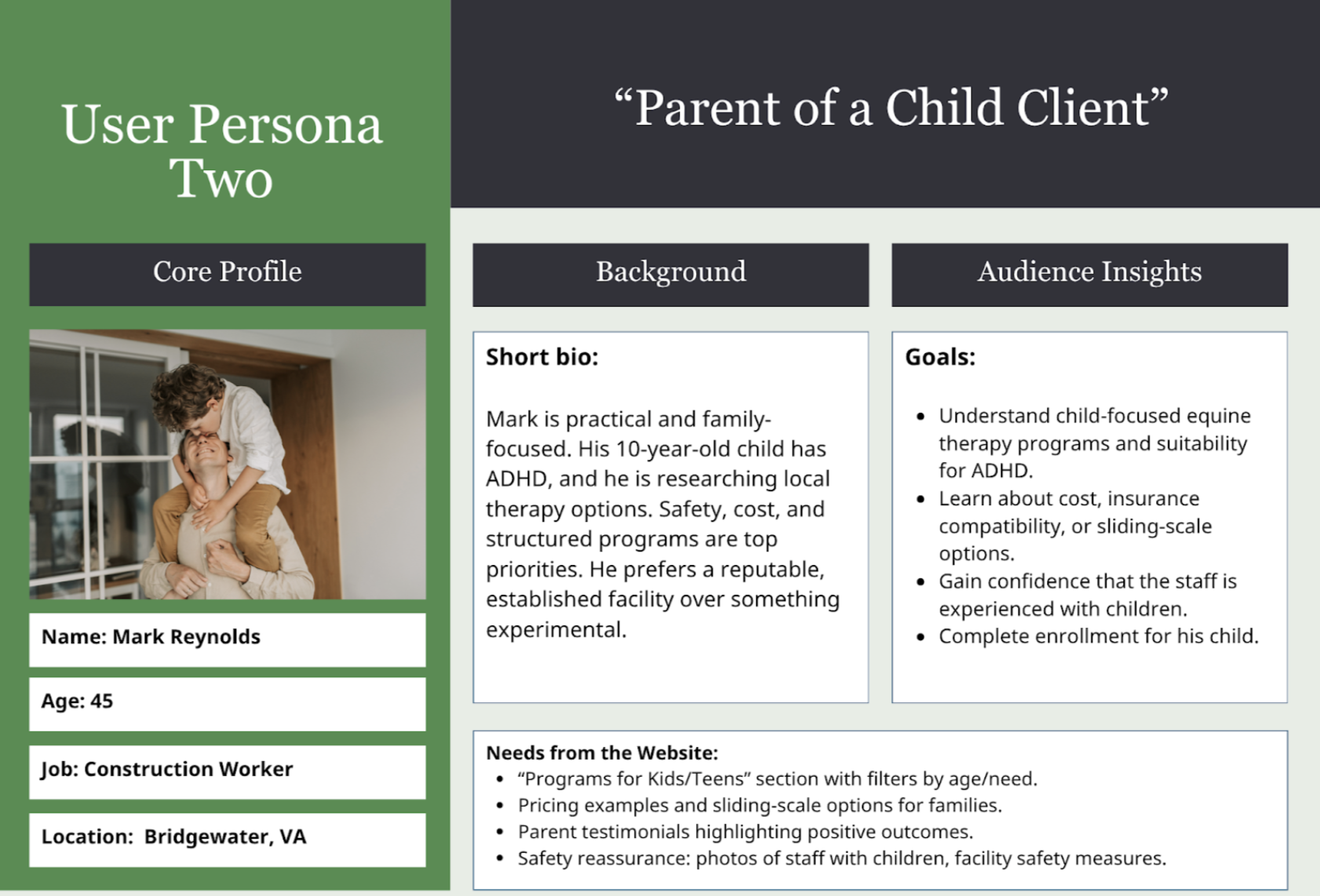
Secondary Persona: The Parent of a Child Client
THE PRODUCT
Our prototypes dealt with a couple key improvements, mainly in information architecture:
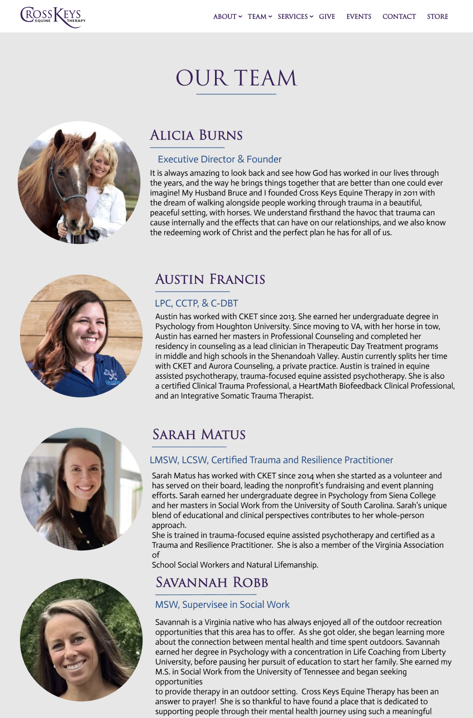
Sectioning of content with additional images to avoid text-blocking.
Implementation of professional-looking fonts to match Cross Keys Branding.
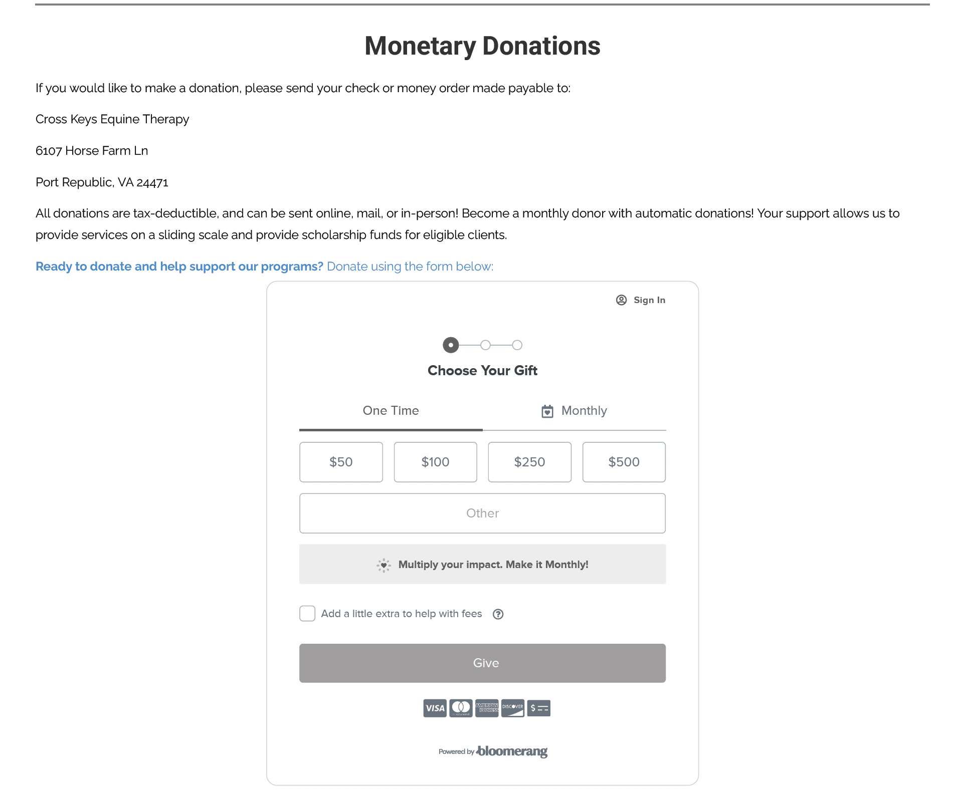
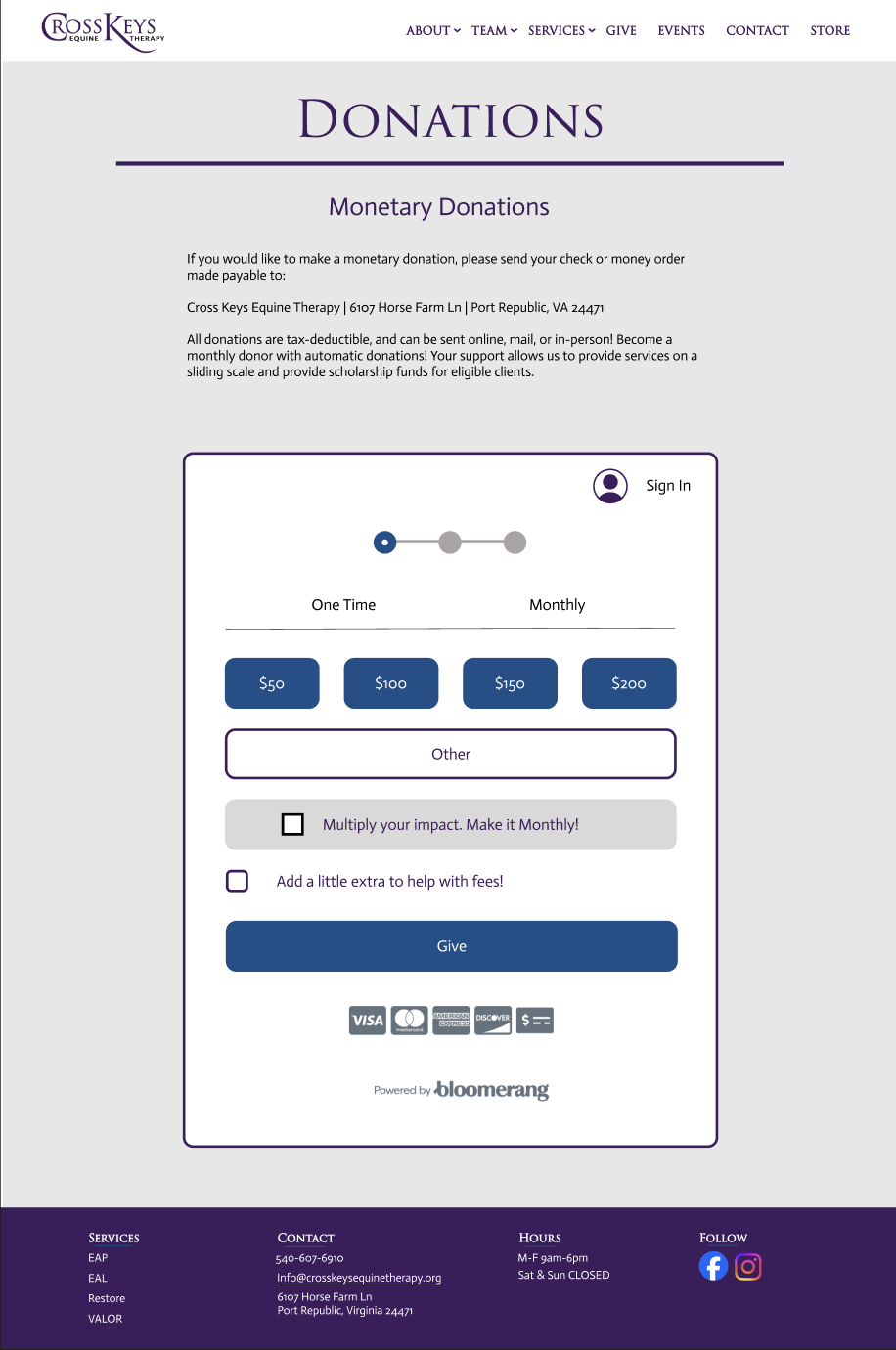
Addition of donations forms for a more intuitive process.
Closing Thoughts
In comparison to the previous prototype, our design was more polished, consistent, and easy to navigate than the original.
By divvying the work between ourselves while keeping on top of one another’s progress, we were able to get the project done days ahead of the scheduled due date.